
Selecting the right sutra copybook depends heavily on your current calligraphy skills, your choice of writing tools, and your personal practice goals. Beginners require structured layouts, clear visual guides, and manageable text lengths to build muscle memory and stroke control without becoming overwhelmed. Experienced practitioners, on the other hand, benefit from minimalist designs, smaller grids, and challenging script styles that allow for fluid artistic expression and deeper meditative focus. By matching the physical and structural traits of a copybook to your experience level, you can ensure a rewarding and sustainable practice.
In this guide, we examine the essential characteristics of sutra copybooks, comparing the needs of novices with those of seasoned calligraphers. We will explore how paper quality, grid structures, binding methods, and text selections influence your writing experience. Whether you are picking up a brush for the first time or seeking to refine your established practice, understanding these key differences will help you make an informed choice.
Understanding the Dual Purpose of Sutra Copybooks
Sutra copying, traditionally known as shujing, is a practice that uniquely bridges the worlds of technical calligraphy and mindful meditation. Unlike standard calligraphy practice sheets that focus on repeating isolated characters or basic strokes, a sutra copybook contains a continuous, meaningful text. This continuity shifts the nature of the practice from a purely mechanical exercise to a sustained mental discipline, requiring consistent posture, breathing, and concentration over an extended period.
Products mentioned in this guide
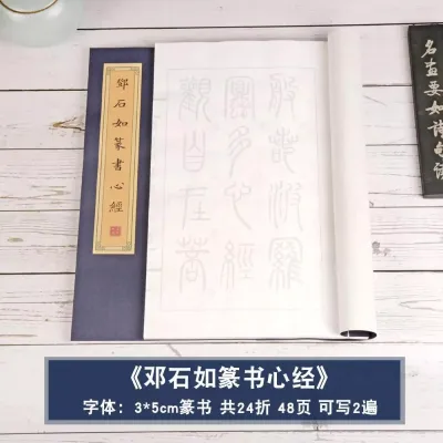
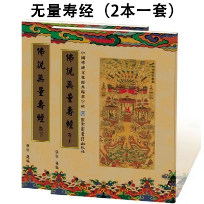
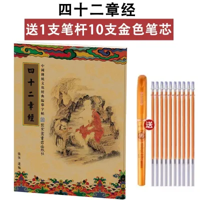
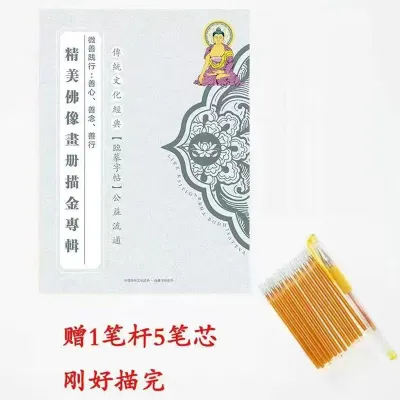
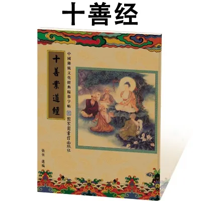
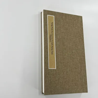
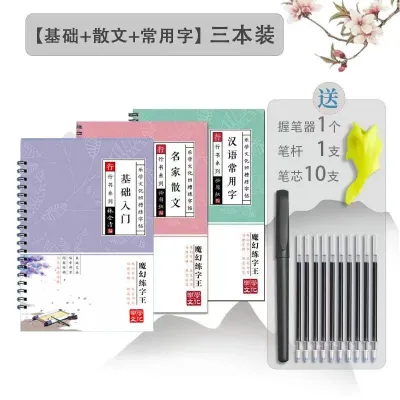
Prices are valid at publication and may change. Please refer to the product page for the latest price.
Historically, this practice was used as a method of preserving sacred texts and accumulating spiritual merit. In modern, busy urban environments like Singapore, this dual purpose makes sutra copying a popular method for stress relief, digital detoxification, and mental clarity. The repetitive yet meaningful flow of the characters helps quiet the mind, but this meditative state can only be achieved if the physical materials support the process. If the paper feathers, the ink bleeds, or the book constantly tries to spring shut, the meditative flow is broken. Therefore, a high-quality copybook must balance technical utility with physical design elements that facilitate an uninterrupted, peaceful writing session.
Furthermore, the transition from writing individual characters to copying a continuous text requires a shift in focus. In character drills, you analyze each stroke in isolation. In sutra copying, you must maintain a holistic view of the page, ensuring that the spacing between characters remains consistent and that the overall visual weight of the columns is balanced. This requires a higher level of sustained attention, making the choice of copybook layout critical to preventing visual fatigue.
Core Features to Evaluate in Any Sutra Copybook
Before selecting a copybook for your specific skill level, it is essential to understand the universal physical and structural specifications that dictate how a book performs under different writing instruments.

Paper Quality and Ink Absorption
The type of paper used in a copybook determines which writing tools you can use. Traditional brush calligraphy requires absorbent paper, such as Xuan paper, which allows the ink to spread slightly and show the nuances of brush pressure. Xuan paper is generally classified into three types: raw (shengxuan), ripe (shuxuan), and semi-ripe (banshengbanshu). Raw Xuan paper is highly absorbent and difficult for beginners to control, while ripe Xuan paper is treated with alum to reduce absorbency, making it ideal for fine-line work and modern pens. For pen-based practice, look for copybooks featuring sized or semi-sized paper, or those with a higher paper weight (typically 80 GSM or above) that explicitly state they are compatible with liquid inks to prevent feathering and bleed-through.
Grid Types and Layouts
Grids are the structural scaffolding of calligraphy. They guide the height, width, and internal proportions of each character. Common grid styles include the “Majiang” (palace) grid, which divides a square into nine smaller sections, and the “Mi-zi-ge” (rice-character grid), which uses diagonal and perpendicular dashed lines. These grids are invaluable for understanding where specific strokes should begin and end. As skills progress, these highly structured grids are replaced by simple square outlines (fangge), vertical columns (wuge), or entirely unlined pages. The choice of grid directly influences how much mental energy you must spend on character placement versus stroke execution.
Binding Styles
The binding of a copybook directly impacts your physical comfort during long writing sessions. Standard perfect-bound books (which use glue along the spine) often require you to hold the pages down with one hand while writing with the other, which disrupts your posture and writing flow. Ideal copybooks utilize thread sewing or an accordion-fold (sutra) binding. Accordion-fold books are particularly prized because they open completely flat on any surface, allowing you to write continuously across a single, unbroken sheet of paper without any spine interference. This format also allows you to display the completed work as a continuous scroll.
Guidance and Comprehension Aids
Many copybooks include auxiliary features designed to help the writer. These can range from faint background characters for direct tracing to side-by-side modern translations, pinyin pronunciation guides, or historical annotations. For those practicing in a language they are still learning, having these annotations can greatly enhance the cognitive connection to the text, making the practice more engaging and meaningful. However, for advanced practitioners, these aids can become visual clutter, which is why copybooks are designed with varying levels of assistance.
Best Copybook Traits for Beginners: Building Foundation
For those new to calligraphy, the primary goal is to build confidence, develop basic stroke control, and establish a consistent practice routine. The ideal beginner copybook is designed to minimize frustration and make the learning curve manageable.
Large Grids and Regular Script
Beginners should look for copybooks that feature large grid sizes, typically between 2 cm and 3 cm per square. Larger grids make it easier to observe the structural components of a character and execute strokes with deliberate control. The recommended script style for beginners is standard regular script (Kaishu). Regular script is highly structured, with clear, distinct strokes and no connected lines, making it the essential foundation for understanding character balance and stroke order. Practicing regular script helps beginners master the “Eight Principles of Yong” (Yongzi Bafa), which are the foundational strokes used in all Chinese calligraphy.
Tracing Formats (Miaohong)
One of the most effective tools for a beginner is the tracing format, often referred to as miaohong. In these copybooks, the sutra text is printed directly onto the page in a very faint red or grey ink. The practitioner writes directly over these guides. This direct tracing helps build muscle memory for stroke length, angle, and spacing far more quickly than trying to copy a reference text freehand onto a blank grid. It removes the anxiety of making mistakes, allowing the beginner to focus entirely on pen or brush control.
Shorter, Familiar Texts
Sustaining focus over thousands of characters is incredibly difficult for a novice. Therefore, beginners should start with shorter, highly familiar texts. The Heart Sutra (Xin Jing), which consists of approximately 260 characters, is the ideal starting point. It is short enough to be completed in a few sessions, providing a satisfying sense of completion that encourages continued practice. Avoiding dense, multi-page layouts early on helps prevent physical fatigue in the hand and wrist, ensuring that the practice remains an enjoyable ritual rather than a physical chore.
Ideal Copybook Traits for Experienced Practitioners: Deepening Flow
Experienced practitioners who have already mastered basic stroke order and character structure require copybooks that challenge their technical abilities and support deeper, uninterrupted meditative states.
Smaller Grids and Freehand Layouts
Advanced calligraphers should transition to copybooks with smaller grids (1.5 cm or smaller) or move entirely to unlined vertical columns (wuge). Writing without internal grid lines forces the practitioner to rely on their own internal sense of proportion and spatial awareness. This freedom allows for personal stylistic interpretation and encourages a more organic, fluid relationship between the characters. The challenge shifts from making individual characters perfect to ensuring the entire column flows harmoniously.
Advanced Script Styles and Aesthetic Formats
While regular script remains a lifetime study, experienced practitioners often explore running script (Xingshu), clerical script (Lishu), or seal script (Zhuanshu). Running script, with its semi-cursive connections between strokes, allows for a faster, more continuous writing flow. This style requires a deep understanding of character structure, as the writer must maintain legibility while executing fluid, sweeping movements. Additionally, advanced practitioners may enjoy aesthetic formats, such as writing with gold or silver ink on dark blue or black paper, which offers a striking visual contrast and a highly traditional, reverent practice experience.
Longer, Complex Texts and Premium Paper
To sustain deep concentration over hours or days, experienced writers often choose longer texts such as the Diamond Sutra (Jin Gang Jing) or the Lotus Sutra (Miao Fa Lian Hua Jing). These extensive works demand a high level of mental endurance and physical consistency. To match this level of dedication, advanced copybooks often feature premium, uncoated Xuan paper that responds exquisitely to subtle changes in brush pressure, ink wetness, and writing speed, allowing the calligrapher’s unique personal style to shine through.
Feature Comparison: Beginner vs. Experienced Copybooks
The following table summarizes the key physical and structural differences to look for when choosing a sutra copybook based on your experience level.
| Feature | Beginner Specification | Experienced Specification |
|---|---|---|
| Grid Size | Large (2.0 cm to 3.0 cm) | Small (1.5 cm or less) or Unlined |
| Script Style | Regular Script (Kaishu) | Running (Xingshu), Clerical (Lishu), or Cursive |
| Layout Format | Faint tracing guides (miaohong) | Blank grids or vertical columns (wuge) |
| Text Length | Short (e.g., Heart Sutra, ~260 characters) | Long (e.g., Diamond Sutra, ~5,000 characters) |
| Paper Type | Sized, smooth, or heavy-weight paper | Uncoated, absorbent Xuan or mulberry paper |
| Binding Type | Lay-flat thread-bound or spiral | Accordion-fold (sutra binding) or loose sheets |
| Primary Goal | Muscle memory and stroke structure | Fluid expression and deep meditation |
Sourcing and Verifying Your Copybook Before Purchase
When shopping for a sutra copybook, especially through online marketplaces or specialized stationery retailers, it is important to verify the physical specifications to ensure the product matches your intended use.
Verify Paper Weight and Ink Compatibility
Always read the product descriptions carefully to check for ink compatibility. If you plan to use a fountain pen, look for explicit mentions of “fountain pen friendly” or paper weights of 80 GSM and above to prevent feathering. If you are using a traditional inkstone and brush, ensure the copybook uses authentic Xuan paper or raw, absorbent paper designed specifically for brushwork. Be cautious of generic descriptions that do not specify paper type, as these often use low-grade paper that bleeds easily.
Check Language, Script, and Completeness
Sutra copybooks are available in various language editions and character styles. Decide whether you want to practice using traditional Chinese characters, which are standard for historical calligraphy, or simplified characters, which may be easier to read if you are accustomed to modern Chinese. Additionally, verify that the copybook contains the complete text of the sutra rather than selected excerpts, as some smaller booklets only feature highlights. Checking the publisher’s reputation can also help ensure the accuracy of the characters and stroke orders printed in the book.
Evaluate Binding Quality
To ensure a comfortable writing experience, look for listings that explicitly state the book can lay 180 degrees flat. If purchasing online, look at user photos to see if the book stays open on its own. In Singapore, visiting physical specialty bookstores or art supply shops in cultural hubs like Bras Basah Complex allows you to physically handle the books, feel the paper texture, and test the flexibility of the spine before making a purchase. This hands-on evaluation is the most reliable way to ensure the binding will not crack or resist staying open during your practice.
Frequently Asked Questions (FAQ)
Can I use a regular fountain pen or gel pen for sutra copying?
Yes, you can use standard fountain pens or gel pens, but you must match them to the correct paper type. Standard gel pens work well on most copybook papers because the ink is less prone to spreading. However, wet fountain pen inks require paper that is specifically sized or coated to prevent feathering and bleed-through. Always check the publisher’s specifications to ensure the paper is compatible with liquid inks before using a fountain pen.
How should I store a partially completed sutra copybook to prevent paper damage?
Sutra copybooks should be stored flat in a cool, dry environment away from direct sunlight. In humid climates like Singapore, excess moisture can cause the paper to warp, mold, or cause completed ink work to smudge. To protect your work, avoid placing heavy, sharp objects on top of the book that could crease the pages, and ensure any liquid ink is completely dry before closing the book or folding an accordion-style page. Using silica gel packets in your storage drawer can also help absorb excess humidity.
Is it necessary to understand the meaning of the sutra while copying it?
It is not strictly necessary to understand the meaning of the text to benefit from the technical practice of calligraphy. However, having a basic comprehension of the sutra’s meaning and philosophy can significantly enhance the mindfulness aspect of the practice. Understanding the words allows you to align your writing pace with the natural rhythm of the text, turning the physical act of writing into a deeper, more reflective experience.
Community discussion
Share your experience or ask a question. Comments are reviewed before publication.