
The best calligraphy practice books for complete beginners are those that match your chosen writing style, feature high-quality paper compatible with your specific tools, and offer a highly structured, step-by-step lesson progression. Rather than jumping straight into writing full words or complex flourishes, a truly effective practice book guides you through basic strokes, letter anatomy, and consistent muscle memory drills. Selecting the right workbook requires looking past attractive covers and evaluating physical features like paper weight, binding, and layout guides.
Learning calligraphy in Singapore often starts as a personal pursuit of mindfulness, a creative outlet, or a way to add a personal touch to stationery and journaling. With countless books available on online marketplaces and in local stationery shops, finding the right starting point can feel overwhelming. A common mistake is buying a book based solely on its aesthetic appeal, only to find that the paper bleeds when using wet ink or that the lessons skip the essential fundamentals.
To build a strong foundation, you need a practice book that acts as a structured mentor. This guide will walk you through how to identify your preferred style, evaluate the physical construction of a workbook, match it to your writing tools, and assess its educational structure so you can make an informed purchase.
Products mentioned in this guide
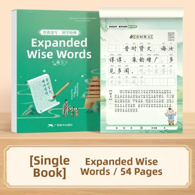
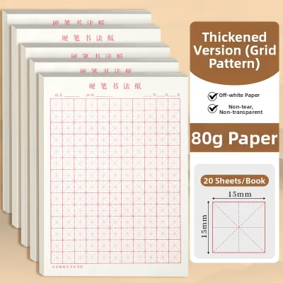
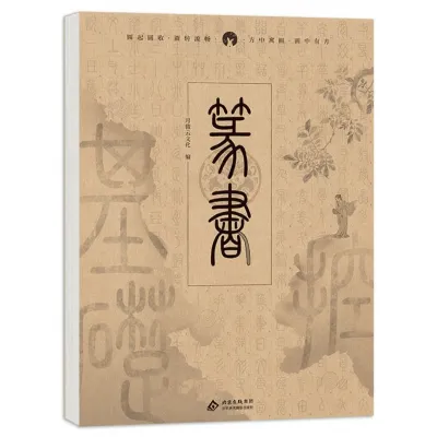
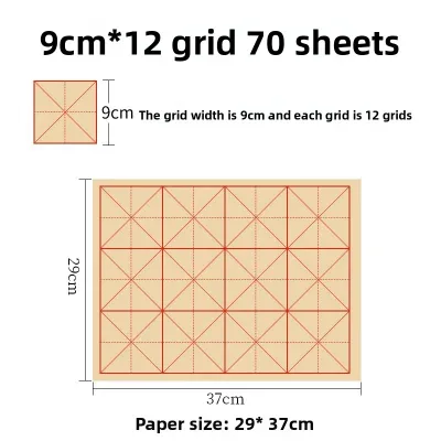
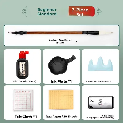
Prices are valid at publication and may change. Please refer to the product page for the latest price.
Identify Your Preferred Calligraphy Style First
Before browsing the book aisles or online listings, you must decide which calligraphy style you want to master. Calligraphy is not a single, universal skill; it is a collection of distinct disciplines, each requiring different tools, hand movements, and rules. Choosing a style first ensures you do not buy a workbook that is incompatible with your goals or tools.
Modern brush lettering is currently one of the most popular styles, characterized by its casual, fluid, and highly expressive look. It relies on flexible brush pens or markers where pressure dictates line thickness—heavy pressure for downstrokes and light pressure for upstrokes. The learning curve is relatively gentle, making it highly accessible for hobbyists who want to create modern greeting cards, journal layouts, or personalized gifts.
Traditional dip pen calligraphy, such as Copperplate or Spencerian script, represents a more formal and historical approach. This style utilizes a rigid pen holder fitted with a flexible metal nib that is dipped into an inkwell. It requires precise angles, specific hand postures, and a deep understanding of historical letterforms. The learning curve is steeper, demanding patience and fine motor control, but it offers unmatched elegance for formal invitations and classic documents.
Hard pen or fountain pen calligraphy, often referred to as monoline or italic calligraphy, uses rigid or semi-flexible nibs that produce consistent line widths. This style is highly practical for daily writing, journaling, and everyday print styles. It focuses heavily on letter spacing, consistent slant, and clean geometry rather than dramatic pressure variations.
Each of these styles dictates a completely different set of foundational strokes and alphabet structures. For example, the basic strokes of Copperplate calligraphy require a strict 55-degree slant angle, whereas modern brush lettering allows for more vertical, playful variations. Trying to learn multiple styles simultaneously using a generalized “all-in-one” book often leads to confusion, poor muscle memory, and frustration.
To set yourself up for success, commit to one specific style for your first few months of practice. Look for a book that explicitly names its target style on the cover or in the introduction. A dedicated book will provide targeted drills that train your hand for that specific tool and script, ensuring your practice sessions are efficient and rewarding.
Essential Features of a Good Beginner Practice Book
A calligraphy practice book is more than just a reading resource; it is a physical workspace where your pen meets paper. The physical construction of the book directly impacts how comfortable your practice sessions will be and how well your tools perform. When evaluating non-fiction practice books, pay close attention to several key physical features.

First and foremost is paper quality and weight. Calligraphy tools, especially dip pens and brush markers, deposit a significant amount of wet ink onto the page. Standard printer paper or low-grade book paper will cause the ink to “feather”—where the ink spreads out along the paper fibers, creating fuzzy edges—or “bleed” through to the other side of the page. Look for books that specify heavy, smooth paper, ideally 100 gsm (grams per square meter) or higher, to ensure clean, crisp lines.
The layout and guide lines printed on the pages are equally critical for beginners. Writing without guides makes it incredibly difficult to maintain consistent letter heights and angles. A high-quality practice book should feature clear horizontal lines: the baseline (where the letters sit), the x-height (the height of lowercase letters), and ascender and descender lines (for the tops of letters like ‘h’ and bottoms of letters like ‘g’). Slant lines, which run diagonally across the page, are also essential for styles that require a consistent tilt.
Another factor to consider is the ratio of instruction to practice space. Some books are heavy on theory but offer only a single line of practice space for each letter. As a beginner, you need to perform dozens of repetitive drills to build muscle memory. Ensure the book provides ample blank or guided space for freehand practice, rather than just a few letters to trace over. Tracing is helpful initially, but independent practice is where true learning happens.
Finally, pay attention to the binding of the book. Standard perfect-bound books (glued spines) tend to snap shut or curve deeply near the center gutter. This forces you to hold the book down with one hand while writing, which strains your wrist and disrupts your writing angle. Look for books with lay-flat binding, spiral binding, or top-bound pad formats. These designs allow the pages to lie completely flat on your desk, giving your hand a stable, unobstructed surface to glide across.
Match the Practice Book to Your Chosen Tools
Your choice of writing instrument must align perfectly with the paper inside your practice book. Using the wrong tool on incompatible paper can ruin your expensive pens or lead to messy, frustrating results. Before purchasing a book, verify that its paper is designed to handle the specific moisture and friction of your chosen tool.
If you plan to use brush pens and markers, you need paper with an exceptionally smooth, almost silky texture. Coarse or highly textured paper acts like sandpaper on delicate felt or nylon brush tips, causing them to fray rapidly. Once a brush tip frays, it can no longer produce the sharp, clean hairlines required for beautiful modern lettering. Look for workbooks that explicitly state they are safe for brush pens or feature coated, ultra-smooth paper.
For those diving into traditional dip pens and liquid ink, the paper must be robust enough to handle highly fluid, wet inks. Dip pen nibs are sharp and can easily scratch or snag on thin, fibrous paper, picking up loose fibers that clog the ink flow. The paper needs to be properly sized—a manufacturing process that limits the paper’s absorbency—so the ink sits on top of the page and dries slowly rather than soaking in and spreading. Look for heavy-duty calligraphy pads or mixed-media paper ratings.
Fountain pens and gel pens are slightly more forgiving but still require careful consideration. Fountain pen inks are water-based and will feather on cheap paper, while gel pens require a smooth surface to prevent skipping. Additionally, the size of your pen’s nib must match the scale of the printed guides in the book. A broad-edge fountain pen requires much larger guide lines than a fine-point gel pen to show off its characteristic thick-and-thin strokes.
Be cautious of generic tracing books or mass-market activity pads that do not specify tool compatibility. These books are often printed on standard, highly absorbent paper intended for ballpoint pens or pencils. If you attempt to use a brush pen or a dip pen on these pages, the ink will likely bleed through multiple sheets, rendering the subsequent pages unusable and frustrating your efforts to learn.
Evaluate the Lesson Structure for True Beginners
A beautiful cover does not guarantee a well-structured curriculum. To make steady progress, you need a book that approaches calligraphy as a structured discipline rather than a collection of pretty letters to copy. When reviewing a book’s table of contents or preview pages, look for a logical, pedagogical progression designed for absolute beginners.
A true beginner’s book should always start with the absolute basics: posture, paper positioning, and pen grip. How you hold your pen and sit at your desk directly affects your line quality and prevents physical fatigue during long practice sessions. The book should also include dedicated warm-up exercises, such as basic lines, loops, and ovals, to help loosen up your wrist and shoulder before you attempt to write.
The progression of the alphabet lessons should be highly systematic. In calligraphy, letters are not learned in alphabetical order; instead, they are grouped by their shared basic strokes. For example, in many scripts, the letters ‘i’, ‘u’, and ‘w’ are taught together because they rely on the same basic underturn stroke. A good book will introduce these fundamental strokes first, then show you how to combine them to form lowercase letters, followed by uppercase letters, numbers, and punctuation.
Once individual letters are mastered, the book must guide you through the mechanics of connecting letters to form words. Letter spacing (kerning) and connection points are notoriously difficult for beginners to master on their own. Look for sections that explain how to transition from one letter to the next without losing consistent spacing or line weight.
Additionally, look for books that include troubleshooting guides. As a beginner, you will inevitably encounter issues like shaky lines, inconsistent slant, or ink pooling. A good instructional book anticipates these challenges, showing visual examples of common mistakes alongside clear instructions on how to correct them.
Avoid books that jump too quickly into complex projects, such as designing full quotes, advanced flourishing, or envelope addressing. While these projects are exciting, attempting them without a solid grasp of basic strokes will only lead to frustration. A solid practice book keeps you focused on the building blocks of the craft until your muscle memory is fully established.
A Conditional Guide to Selecting Your First Practice Books
To help you narrow down your choices, consider your specific goals, budget, and preferred learning style. There is no single “best” book for everyone, but there is a right book for your specific beginner profile. Use the following framework to guide your selection.
If your primary goal is relaxation, mindfulness, and creating modern aesthetics, focus on modern brush lettering workbooks. These books typically feature a friendly, encouraging tone and focus heavily on the physical sensation of writing. Look for editions that offer step-by-step breakdowns of both lowercase and uppercase alphabets, along with practical tips on how to use modern brush markers of various sizes.
If you are drawn to historical accuracy, formal elegance, and the classic art of penmanship, seek out traditional calligraphy manuals. These books are often more technical, offering detailed explanations of shade and hairline theory, precise pen angles (such as 45 or 55 degrees), and historical context for scripts like Copperplate, Gothic, or Italic. They demand more discipline but provide a highly structured, academic approach to the craft.
If you are practicing on a budget or want to try calligraphy without investing in specialized pens, look for books focused on “faux calligraphy” or monoline lettering. Faux calligraphy teaches you how to mimic the look of brush or dip pens using standard gel pens, fine-liners, or even ballpoint pens by manually drawing in the thick downstrokes. This is an excellent, low-cost way to learn letter forms, spacing, and consistency before purchasing more expensive tools.
Regardless of which path you choose, always perform a quick quality check before buying. If purchasing online, look at the publication details and read customer reviews specifically mentioning paper quality. If shopping in a physical bookstore in Singapore, gently feel the paper texture and check the table of contents to ensure it includes a complete alphabet guide rather than just a few sample pages. Taking a few minutes to verify these details will save you hours of frustration and set you on a smooth, enjoyable path to mastering calligraphy.
Frequently Asked Questions (FAQ)
Do I need to buy a specific practice book, or can I use printable worksheets?
Both bound practice books and printable worksheets have their place in a beginner’s toolkit, and they can easily complement each other. Bound non-fiction books offer the convenience of a curated, step-by-step curriculum in a single, durable package. They are easy to carry, keep your progress organized in one place, and often feature high-quality, specialized paper that is difficult to replicate with standard home printer paper.
Printable worksheets, on the other hand, offer excellent cost-effectiveness and infinite repeatability. If you struggle with a specific letter, you can print out that particular page as many times as needed without ruining a bound book. However, you must print them on high-quality, smooth paper (such as 100 gsm presentation paper) to prevent your pens from fraying or bleeding. A great strategy is to start with a few free or low-cost printable worksheets to test different styles, and then invest in a comprehensive, high-quality bound workbook once you have committed to a specific style.
How long should I practice with a beginner book before moving to intermediate projects?
There is no fixed timeline or specific number of pages you must complete before moving on; progression depends entirely on your consistent practice frequency and the development of muscle memory. Some beginners develop steady hands within a few weeks of daily 15-minute sessions, while others may take several months of occasional practice.
Instead of watching the calendar, look for observable signals of readiness. You are ready to explore intermediate projects—such as blending colors, adding basic flourishes, or writing on non-paper surfaces—when you can consistently execute basic strokes without relying heavily on printed guide lines, maintain a steady slant angle across a full page, and connect letters smoothly without hesitation. Even after you transition to creative projects, keep your beginner practice book handy; using its basic drills for a five-minute warm-up before every writing session is an excellent habit that professional calligraphers maintain for years.
Community discussion
Share your experience or ask a question. Comments are reviewed before publication.